Information Architecture
We first started off our research by crafting a flow chart to quickly understand the information architecture of our app.

First Round of Testing
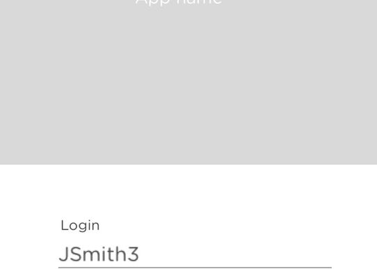
By creating a flow chart we could understand how our user could flow through the information and identify key points in the application quickly, without having to design wireframes. From here we printed out these stages and tested them on our pool of interviewees.
Results
Testing the information architecture on users gave us insight that we didn't consider before and disproved preconceived notions that we had. The first was that our on boarding might create distrust as it was asking for too much right off the bat and that it needed to be segmented in order to feel digestible. We also discovered that in order to create trust with our users we needed to fully explain the point of our application and the benefits that we offered because of the amount of private information we were asking for.
A preconcieved notion that we had was that users wanted to see the total amount of loans that they had at the top of the screen, and through testing we recieved feedback that this was not the case. Testers prefered to see amounts in chunks rather than a sum.


